

This project was part of my CSEN 129 class(Human-Computer Interaction). We were tasked with proposing a problem and finding a solution that incorporates principles of good human-centered design. The theme for the course was behavior change, focusing on how technology can support individuals in adopting and sustaining healthier habits.
My team and I chose to redesign the user experience around Terms of Service and privacy policy acceptance to improve comprehension and support informed decision making.
Purpose
Project Overview
-
Many users often ignore Terms of Service or privacy policy acceptance which can lead to users being exposed to privacy and security risks, which often reduces the trust of the user with the platform. How can we support users in these concerns without overwhelming them?
-
Leverage progressive disclosure techniques to simplify dense legal documents.
Integrate real-time guidance or highlights to clarify critical clauses.
Create adaptive interfaces that accommodate diverse user familiarity levels with legal jargon technical knowledge.
-
As the only one on the team who was experienced and proficient with Figma, I designed the app from start to finish, as well as contributing new solutions for the app itself that I implemented.

Establishing Our Design Problem
What We’re Addressing
How can we redesign the user experience around Terms of Service and privacy policy acceptance to improve comprehension and support informed decision making without overwhelming the user?
Significance
Legal/Privacy Concerns: Misunderstanding terms can expose users to privacy or security risks.
User Experience: Poorly designed TOS prompts reduce trust and often lead to blanket acceptance.
UI Complexity: Balancing the need for transparency with users’ limited time and attention presents a multifaceted challenge.
Design Opportunities
Leveraging progressive disclosure techniques to simplify dense legal documents.
Integrating real-time guidance or highlights to clarify critical clauses.
Creating adaptive interfaces that accommodate diverse user familiarity levels with legal/technical language.


Our Solution
-
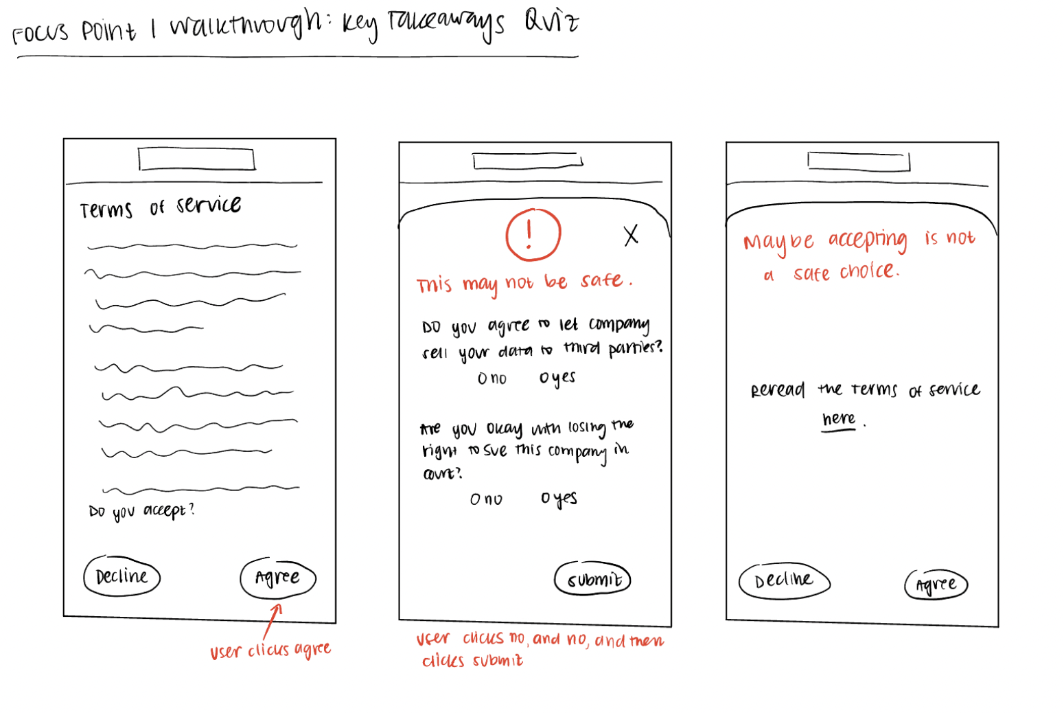
Key Takeaways Quiz
Before accepting a Terms of Service agreement, users will be asked to complete a short, interactive yes/no quiz that simplifies complex legal terms into straightforward questions. Instead of dense legal jargon, the quiz will present "dummy" versions of key clauses, such as:
"Do you agree to let this company sell your data to third parties?"
"Are you okay with losing the right to sue this company in court?"
"Do you agree that this service can track your location at all times?"
By writing the terms in easy to understand language, users will be aware of what exactly they are signing up for, making the entire process a lot more transparent.
-

Highlighting the Concerning Parts of a Contract
Before accepting the Terms of Service, users will be presented with a visual breakdown of the most concerning clauses in plain language. Instead of scrolling through dense legal text, they will see color-coded warnings based on risk level. Examples include:
🔴 High Concern: “This company can sell your personal data to third parties.”
🟡 Medium Concern: “Your data may be used for targeted advertising.”
🟢 Low Concern: “This service uses cookies to improve user experience.”
By flagging problematic clauses upfront, users can quickly assess whether they are comfortable with the terms before accepting, ensuring a more informed decision-making process. Color coding also helps users instantly recognize the severity of certain clauses, and works against the design friction companies have in place (green to consent, red to decline, etc.).
Higher Level Themes
Obtained through Heuristic Evaluations and User Testing

Visibility and Feedback Mechanisms
Heuristic Evaluation Issue: Users were not receiving immediate feedback after making selections in the quiz (leading to confusion about whether their preferences were adhered to)
Revision Documentation
Before: Users selected quiz responses but received no confirmation or progress indicator.
After: Instead of an instant pop-up message, a loading screen now appears briefly after selection, displaying a message like:
"Processing your selection..."
The loading screen then transitions into a confirmation message, ensuring users that their response was successfully saved.

Simplification & User Comprehension
Heuristic Evaluation Issue: Users lacked options if they found a website's ToS concerning. The system did not provide guidance on safer alternatives, leaving users uncertain about their next steps.
Revision Documentation
Before: Users were informed about risky ToS clauses but had no immediate options if they chose to avoid a website.
After: A new feature was added to offer alternative website recommendations for users who decide not to proceed with a platform due to its ToS.
Example: If Hinge's ToS is flagged as unsafe, users receive a recommendation to try Tinder, which has a more user-friendly policy.
A dedicated links page appears after the quiz, directing users to safer alternatives based on their preferences.
Customizing ToS Preferences for Informed Decision-Making
Heuristic Evaluation Issue: The system did not allow users to specify which Terms of Service (ToS) clauses they were most or least comfortable with. Some users cared more about data tracking but were less concerned about content licensing.
Revision Documentation
Before: Users could only read ToS summaries but had no way to flag specific concerns or receive personalized feedback based on their preferences.
After: A customization feature was added, allowing users to flag unacceptable terms. Based on their responses:
The system generates a personalized summary, highlighting the most relevant concerns.
Users receive a tailored risk assessment, making it easier to make informed decisions without reviewing the entire ToS.